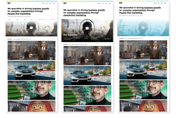
Challenge
This case study outlines our process involved in redesigning RPA’s advertising agency website to enhance our user experience, improve engagement, and drive conversions. The objective is to create a visually appealing, intuitive, and user-centric website that effectively showcases the agency's services, portfolio, and expertise.
Solution
Create a refreshed and visually engaging website that reflects the agency's creativity and innovation.
Quick and easy access to the agency's portfolio, case studies, and client testimonials is essential.
Responsive design and optimized performance are crucial for an enjoyable browsing experience.
Project Goals
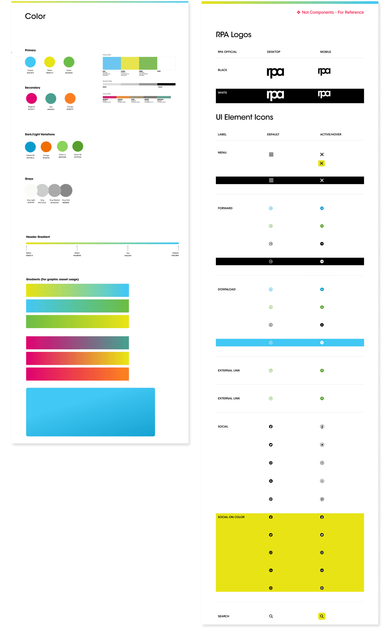
Refresh the copy and the visual design to reflect the values of the agency
Restructure the site to be more efficient at guiding the users to their desired information
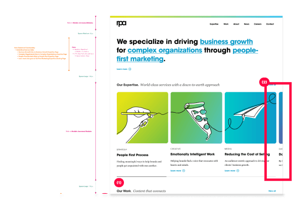
Reconstruct the modules to better demonstrate the work of the agency and give insight to the user before they proceed with their navigation
Personas
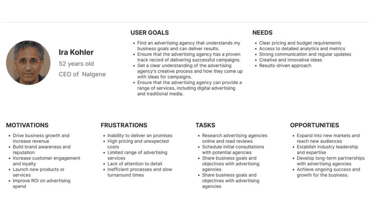
I compiled usability tests to understand users' needs, behaviors, and pain points. Once we gathered key traits such as demographics, goals, motivations, and challenges we synthesized our persona profiles.
Sitemap
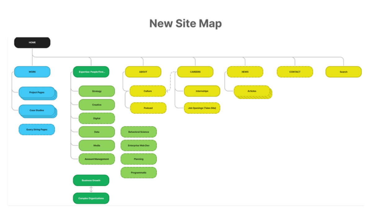
As our site map comparison below shows, our previous site lacked the more intuitive features required to meet the needs of our audience. We added a search function and expanded the sub pages for clarity in a user’s navigation.
Wireframes
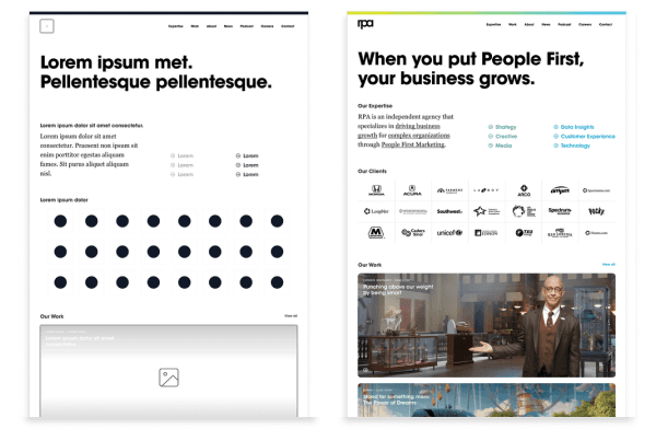
To begin the project, extensive research was conducted to understand the target audience, their preferences, and expectations from an advertising agency website. User interviews, surveys, and competitor analysis provided valuable insights into user needs, pain points, and industry best practices.
Iterations & Development
Once the final design was approved, the development team translated the design into a functional website. Responsive web design techniques were employed to ensure optimal performance across various devices and screen sizes.
